Are you confused about the extremely high bounce rates on your website? Your inconsistent website design might be the issue.
Inconsistent website design, with its jarring visuals and confusing layouts, can disorient users and lead them to click away. A 2023 study by Forrester Research found that a significant percentage of online shoppers abandon websites that lack visual consistency, underscoring the critical role of cohesive design in maintaining user engagement.
Website design is the digital equivalent of an airport’s layout—imagine yourself at a bustling international airport, eager to embark on a long-awaited adventure. Excitement thrums through you as you navigate the terminal.
Suddenly, the familiar routine of navigating an airport is thrown into chaos by inconsistent website design. Instead of clear signage and announcements in your native tongue, a cacophony of languages assaults your senses. Departure boards flash cryptic symbols, and gate numbers seem to change with every blink.
Disoriented and frustrated, your dream vacation quickly spirals into a stressful struggle to decipher the basics of navigating the airport itself. This is the same disarray users experience when faced with poorly executed website design—confusing, disorienting, and a fast track to frustration.
Just like a bewildered traveler at the chaotic airport, users will likely abandon your website in search of one that speaks their language (or at least uses a consistent design language).
Website Design: Building Bridges for User Understanding
Think of your website as an international conference hall. Every page is a new slide, and your visitors are the various listeners, interested in interacting with your brand or product. As a good conference uses signs and bulletins in a language understandable for everybody (or with the help of interpreters), your website also requires a unification of the design to overcome the gap between you and the visitors.
The idea is to have a consistent design working as a communicative platform so that every visitor on your site receives your message loud and clear.
When the visitors can understand and find their way through your site then they are more likely to interact, buy, and come back. Here, consistent design acts as a universal language, ensuring your message is understood loud and clear by everyone who visits your website.
A major mess-up for IRCTC Website Design
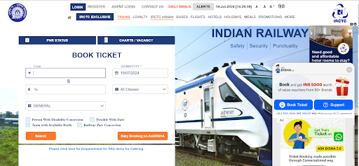
The IRCTC website has been criticized for its outdated design, complex navigation, and frequent technical issues. Users often struggle with its cluttered interface, slow loading times, and confusing booking process.
The inconsistency in the design of this website also makes it less aesthetically pleasing. The users only visit this website when they have to complete a booking that cannot be completed through other platforms. This is a major issue in the web design of the IRCTC website causing criticism online.
The Enemies of Clarity: Inconsistent Design Elements
Like poorly placed toll booths on a highway causing sudden stops and frustration, inconsistent design elements on a website can throw unexpected curveballs at users.
Research by UserTesting (2022) suggests that users may spend up to 74% more time navigating websites with unclear structures. This wasted time translates to lost engagement and ultimately, lost business.
Here are the elements that you need to keep in mind:
The Font Style for the website
Picture a conference presentation where the text on the slides is in different and often unrelated fonts; some are cute while others are formal. Confusing, right?
The same effect is produced by inconsistent fonts. Ensure that the fonts used are harmonious and vertically align the headers to the body texts and the buttons used in the sites. Imagine it as being able to use the same font type and size – it helps the attendees to concentrate on the information that is being presented without receiving a sudden shock from the stylistic shift.
Choosing Harmonious Fonts:
Font Pairing Tools: Use online font pairing apps such as Google Fonts or Adobe Typekit to search for font pairings. These tools demonstrate the best combinations and come with previews.
Basic Principles: Follow basic principles like pairing a serif font (with small decorative lines) for headings with a sans-serif font (without decorative lines) for body text.
Contrast & Readability: Ensure that there is proper differentiation between the chosen fonts. Do not combine two fonts that are very similar or fonts that are very thin for the body text because the text will appear hard to read on all devices.
Brand Consistency: Consider your brand identity when choosing fonts. Choose fonts that reflect the overall feel of your brand (e.g., playful, professional, modern).
An example of Figma: Harmonious Fonts for Web Design
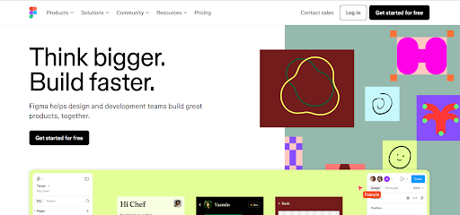
As a design tool, Figma understands the importance of visual harmony. Their website utilizes Inter UI, a clean and geometric sans-serif font, for both headings and body text. This creates a sense of professionalism and aligns with their focus on user interface and design tools.
Bold variations of Inter UI are used for emphasis and buttons, maintaining a consistent look while providing clear functionality.
The Color Chameleon: Website Color Schemes
Imagine that you are in a conference hall and every presentation room has a completely different color palette. Overwhelming, right?
Any website that comes with a barrage of colors on each of the pages is a disaster to the eyes. The color of the site should be in harmony with the company’s image and should be used consistently on the site. You can imagine it as a color scheme of your conference hall; it determines the overall mood of the conference.
How to choose a color scheme for the website?
It is very important to keep color psychology in mind when choosing website color schemes. The colors that you choose will set the mood for the visitors of your website making them feel certain emotions.
For instance, blue is often associated with trust and calmness, making it an excellent choice for financial and healthcare websites. Conversely, red evokes excitement and urgency, making it effective for e-commerce sites and calls to action.
You can use tools like the Colorhunt website to make better decisions about your website’s color scheme.
The Tiffany Website Example
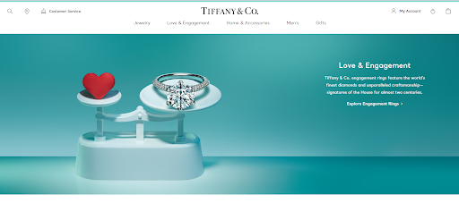
Tiffany & Co. uses a unique shade of turquoise, often referred to as “Tiffany Blue.” This color is associated with luxury, sophistication, and calmness, perfectly reflecting the brand’s image of high-end jewelry.
The Website Layout Consistency: How to structure a website layout?
Consider a conference in which the presenters are moving from one topic to another, without any apparent coherence. Irregular arrangement results in the same confusion as well as the chaotic arrangement of different books.
Organize your page in some structure and then follow it to the letter. This comprises items such as the navigation bars, the search bars, and the calls to action. Consider it as having a proper and sequential flow for your conference presentations—it puts the attendees in a position to follow the discussion and get the gist of the matter.
When avoiding such design flaws, you produce a better-coordinated and more appealing user experience for your audience as they can be able to go through your content and even engage with it in the best way possible.
An example of the Airbnb Website Layout
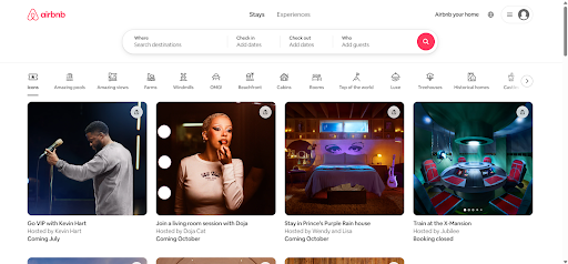
Airbnb utilizes white space effectively. Their website has a clean layout with ample space between search bars, image galleries, and text blocks, making the content easy to digest.
Your Website’s Secret Weapon: The Style Guide
Here’s your interpreter in the fight against inconsistent design: The website style guide. This document serves as your website’s blueprint, outlining your brand’s colors, fonts, and design elements.
Think of it as a comprehensive glossary for everyone involved in creating and maintaining your site, ensuring everyone communicates in the same design language (literally!).
Material Design by Google: An efficient Style Guide resource for businesses
This open-source design system isn’t for a single website, but a framework for building consistent user interfaces across web and mobile applications.
Material offers extensive resources for developers and designers, with clear guidelines for layout, color, typography, animation, and more. Material Design is a popular choice for building modern and user-friendly UIs.
Beyond the Basics: Weaving a Tale for Engaged Users
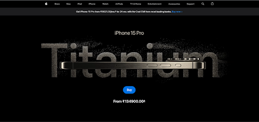
In the previous section, we have described that it is necessary to have a consistent design for the creation of a user-friendly website.
You can elevate your website design by incorporating elements that truly captivate your visitors:
Interactive Storytelling
The use of a well-known structure called The Hero’s Journey can be helpful in the development of website design. Similar to a good conference presentation your website can lead the user through a similar experience – from awareness of the problem or desire to your solution (your product or service).
Charity Water’s Walk for Water Campaign
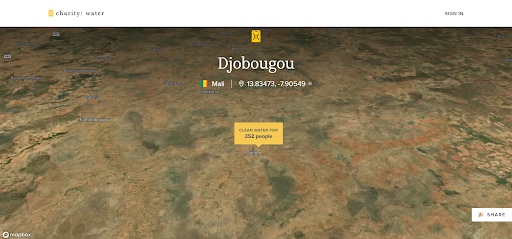
Their website allows users to virtually “walk for water” alongside a girl in a developing country, experiencing the daily struggle for clean water. This interactive experience fosters empathy and motivates users to donate to the cause.
Visual Storytelling
Pictures and videos in HD quality are very effective in capturing the attention of the users and passing the message. Consider them as the eye-popping graphics that make your conference slides more engaging.
An example of Visual Storytelling in Patagonia’s Web Design
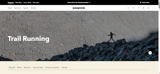
Patagonia excels at visual storytelling, weaving a narrative of environmentalism and outdoor adventure. Their website is a blend of stunning photography and captivating videos showcasing breathtaking landscapes, passionate athletes, and the impact of their products. This visual storytelling goes beyond just selling products, it inspires users to connect with nature and embrace an active lifestyle.
Microinteractions
Subtle animations and interactions can add a layer of polish and delight to your website. Imagine them as interactive elements sprinkled throughout your conference hall, like responsive lighting or touch screens that provide additional information. These small details can keep users engaged and wanting to explore further.
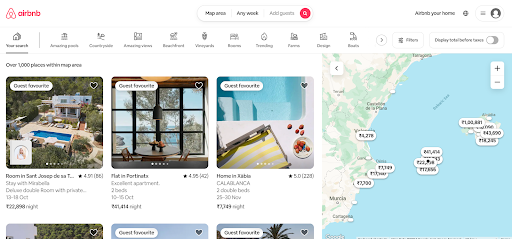
An example of Airbnb using micro-interactions on their website
Airbnb immerses users in travel experiences through its website. Hovering over locations on their interactive map highlights specific listings with subtle animations and visual effects. Clicking on listings activates smooth transitions, showcasing high-quality photos and details about the property. These micro-interactions create a sense of exploration and excitement, making users want to dive deeper into potential travel destinations.
The Call to Action: A Clear and Consistent Message
Don’t let your visitors get lost in the shuffle! A website with consistent design is a website with a clear call to action. Whether it’s prompting users to contact you, subscribe to your newsletter, or make a purchase, your call to action should be prominent, easy to understand, and visually consistent with the rest of your website.
Think of it as the final point of your conference presentation, a clear and concise takeaway that leaves attendees with a specific action to take.
An example of Clear CTAs on the Spotify website
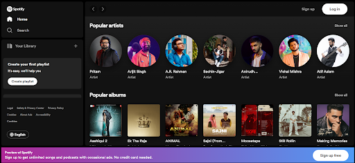
Spotify focuses on a clear and consistent CTA: “Sign Up Free” (or “Get Premium” for paid plans). This CTA appears prominently on the homepage and throughout the website, often paired with visuals showcasing music genres, playlists, and podcasts. The consistent messaging helps users understand how to access Spotify’s music library.
In Conclusion: Consistency is Key
By prioritizing consistent website design, you’re not just creating a visually appealing website; you’re building a bridge of clear communication with your users. A website that speaks the same design language on every page fosters trust, enhances user experience, and ultimately helps you achieve your website’s goals.
Building a website can be a complex journey. Don’t underestimate the power of a consistent design foundation. Book a consultation now!!
We’ll partner with you to understand your brand identity and craft a website that reflects your unique voice throughout every page. Learn more about our customized design approach and discover how Webwingz can help you build a website that resonates with your audience.
