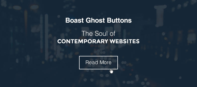
You may be scared stiff when you hear about phantoms but web-designers with gusto are welcoming ghosts on their web planet. Inspired by this mysterious and spine-chilling transparent creature, a new design trend has taken the web-designing industry by storm, ghost buttons. Like ghosts even this influenced button style grabs instant attention of the viewers. Translucent, naked and see-through buttons has popped up as a popular design element and has completely transformed the look of the websites. Except the weird name, there is nothing scary about them; in fact it appears as an elegant and delicate component which elevates the user experience. It offers visual simplicity blended with smooth functionality. Currently, ghost buttons are a part of various websites but they are most admirable among single-page or flat-design websites. Usually ghost buttons are integrated with big-background images as its naked presence does not block the view of the image. Though it is visible, its personality is not too loud, it’s subtle and delightful.
Features of the ghost button:
Ghost button follows a typical pattern. Generally, most of the below mentioned factors are cooperated in ghost buttons:
- The button appears to be hollow
- They have a clean and clear look and feel
- The button is surrounded by a solid outline with a simple text inside
- The color of the button border and text is either white or black, most of the times
- Ghost buttons are usually highlighting features, especially on the homepage
- Most of the time, single ghost button is used or sometimes there is a small group
- The buttons are of geometric shapes like rectangle, square, diamond or circle
- To make it visible and clickable, ghost buttons are bigger than traditional buttons
- Ghost buttons are used in single-page, flat or almost flat design websites.
Advantages of ghost button:
Do you think ghost buttons will match your design style? The simple look of the buttons mostly works for any type of website.
Let’s check how ghost buttons will enhance your web-design:
- Being transparent in nature, it easily gets blended with the surrounding properties and appears as a part of the design
- The minimalistic approach of the button stands out on the large images and creates a focal point
- As the button looks different from the usual buttons, it comes across as a surprise element for the viewers and entices them to click on it
- It is easy to design and is less time-consuming
- If nothing else then at least for being trendy you can include this button style in your web-design which perfectly matches the contemporary design method.
- You can distribute the viewers attention between background images and hollow components that reflects style
Points to remember while incorporating ghost button:
- Make sure ghost buttons complement the background images. It should be contrasting, if the image is dark, the button should be of light color and vice versa
- The text should be kept simple and readable
- Ensure that the buttons do not cover the essential part of the background image
- Place the button where it is easily noticeable
- It is not necessary that the background for the button should be full-screen photography image, you can keep blurred background or a vibrant colored or even a large video background
- Overall, strengthen the buttons with sleek typography, bold backdrops and effective call-to-action.
If you are using any fresh element make sure it doesn’t just look trendy but should be functional too. Thus when you use ghost buttons, make it look innovative and inviting.

