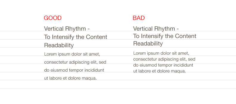
When we allude to typography, mostly its creative side is taken into consideration but there is also a technical side to it which is usually overlooked by most of the web-designers. This side of typography is a tough grind, since it fundamentally deals with numbers and proportions. When you will understand typography, more deeply you will be able to alter the fonts and its styling for better designs and enhanced reading experience. This is where vertical rhythm will come under limelight. It is vital to consider vertical rhythm while designing a website since it will make content reading painless and will result in better user experience. When the viewer drives his eyes down the web-content, the text should look as if it is aligned evenly on an imaginary grid that will make the rhythm melodious and structured. To set a perfect rhythm, you need to figure out the right proportions by altering the spaces and size of fonts. Though it will be initially troublesome to catch the flow but once you understand the concept, you can stay in rhythm.
Rhythm is basically a repetitive pattern to be followed. On web, vertical rhythm helps to create unity in design. The more balanced and uniform pattern, the easier for the viewers to go through the content.
What are the basics to achieve vertical rhythm?
Vertical rhythm on website is mostly contributed by font-size, margins and line-height. Let us focus on these elements and find out how you can evaluate vertical rhythm:
Font size and line-height:
What is the main element of your content? It is certainly the font, so you need to start the process by setting the correct font size. You need to first define the default font size. In order to make the text readable, you require to define the space between the lines of text. The line-height depends upon the font size. The line-height has to be spacious, to make the text clear and understandable. The gap between the paragraphs should be associated to the basic line- height unit. No matter what type of font style, you choose, you need to go with the line-height which you had determined for paragraphs.
Margin size:
To achieve a perfect vertical rhythm, margin plays a very vital role. The text size does not remain constant on web pages. Generally the heading and the font size of the subject matter varies. Thus, to maintain vertical rhythm, you need to keep the line-height same but change the margin size accordingly. To achieve harmonious rhythm, the margin size has to be same as the size of line height. It will make the text look consistent. Setting margin-size for heading can be a tricky process, since it is more comprehensible. To solve this difficulty, you can take some amount of space from the margin at bottom and add that space at the top margin.
Vertical rhythm has a significant impact on the content readability. Hence it is worth dedicating some time to create symmetrical rhythm on your website.

