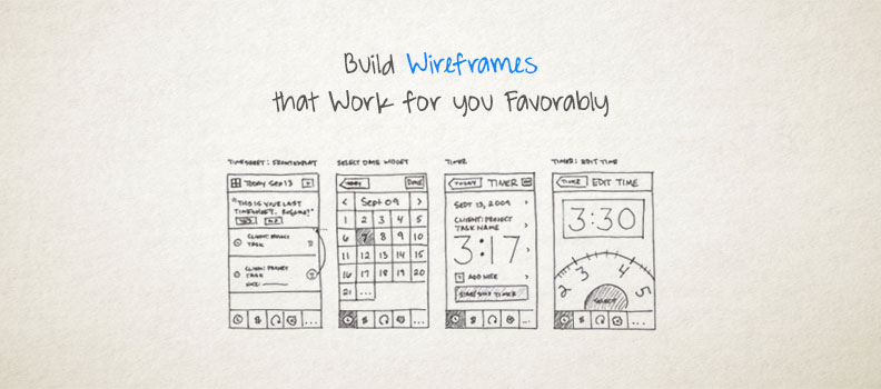
Some feel wireframes are still of the essence while some feel it’s defunct. Candidly speaking, wireframes are an intrinsic part of your web-development process. Skipping wireframe and directly jumping to designing can be a bad option. Websites are getting inch by inch complicated and designers are challenged to integrate more time-based interactions, complex on-page functions and generate more mesmeric experience. Wireframes are a perfect solution for all your problems. The simple block-diagram which lay bares the planned layout and functionality of the project is a strong foundation to start building. Wireframe is handy for developers, designers as well as clients, since this tool gives them picture of the website structure on which they can do necessary revisions, effortlessly. It is a visual illustration to which you can refer while designing.
Wireframes do not include any graphic ingredients like real images, typography or colors; it just serves as a blueprint for your website. All the general elements of the website are represented in a simplified manner like images are presented in form of square boxes with crossed lines, horizontal navigation components are long boxes while text are generally in scribbled format. The depth of detailing in your wireframes is a prejudiced decision. Whether you want it to be simple or complicated, it’s just the matter of choice. On the whole, you have to just pay attention to the content and structure.
So, let’s check-out how you can create wireframes that will work effectively for you:
Keep it simple; don’t tempt to make it look pretty:
The black and white framework may seem to be dreary but don’t try to make it look attractive. Wireframes should focus on the functional aspect and not on the visual appeal. Wireframe should be free from all graphic destructions.
Mandatory elements on wireframes:
Whatever you feel is important on your website should be included in your prototype. Ignoring any element just because you know by default it has to be included in your web-design, can shockingly be neglected to add since it was not on wireframe. Company logo, navigation buttons, search boxes, content space, user login space are the mandatory elements that should be incorporated in your wireframe.
Provide annotations wherever required:
More than simply being an element for in-house discussion, wireframes are widely used for client-demonstration thus you cannot goof up. Since wireframes are just a sketch, all the web components may look similar so there are possibilities you yourself might get baffled while explaining. For example a rectangle box representing text box may be a search box, text box for log in details, e- mail address or anything else. To avoid such confusion, whichever field is imperative and puzzling, annotation or a separate note should be given.
Don’t be paranoid with your wireframes:
Criticism is something which always hurts. Well while asking for feedback, it’s quite obvious your wireframes may get criticized as it’s a rough copy. It is not your final design to get so attached with it. Remember wireframes are created to invite suggestions of team members as well as clients, so there is no harm if it gets criticized. You should always leave some room for changing requirements.
Use softwares for complicated wireframes:
You can use the traditional pen and paper for creating wireframe but if it’s too complex then it is better to switch to softwares that allow you to create wireframes easily. You just need elements like lines, text and few geometric shapes to develop a wireframe. There is an array of softwares which helps you to create wireframes that can act as interactive prototypes.
Wireframes are playful and interesting. In fact you can gather more ideas, promote interaction and create a solid groundwork for your web construction. Therefore skipping this step can be dicey.
For more information please go to our web design page or our contact page.

