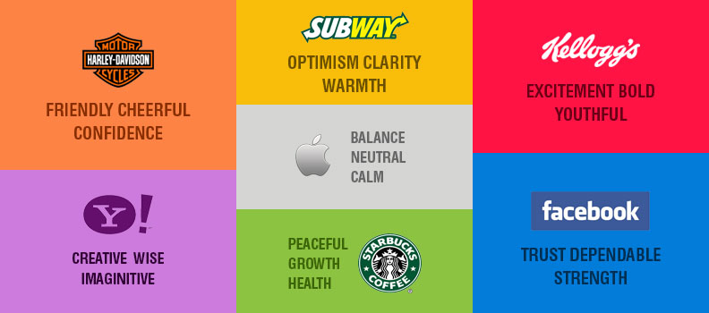
Colors have direct impact on our mind and soul thus due to this essence, it is considered to be a central element in the field of designing. Colors do not add entrancing quality to designs but reinforces it. This crucial ingredient has strong influence on branding. Whether it is the signature red color of Coca-Cola, inducing perfection with white color of Apple or the nostalgic purple color of Cadbury, a wide array of such famous brands are bonded with their trademark colors since eons because it has significantly become their brand identity. While deciding color for your brand, you have to think from emotional perspective in order to build connection with the consumers as well as think practically to look out of ordinary. Here is where the color theory comes into picture. Colors are extensively divided into two categories warm colors and cooler colors; you need to choose a specific color that is relevant with your brand.
Below is the list of significant colors which has created a remarkable identity for copious brands around the world:
Blue:
Blue is the coolest color which is used in majority of brands. Most of the banks and financial institutions use this color for their logo. Blue creates calm, trustworthy and dependability feel hence is it usually used by businesses where customer interaction is at high level. Blue has been used in so many brands that sometimes it becomes difficult to identify the brand. However there are various shades of blue and you can go for the tint which best suits your business.
Black:
The bold and classy black color is mostly used for branding sophisticated and expensive products. Black can be part of any brand. You can incorporate this classic color with any vibrant hue and create a distinctive identity for your brand. Hotels, drinks or any luxurious brand can go for this never out of style color.
Yellow:
The eye-catching and lively yellow color has become one of the hottest colors in business. This color has proven to catch attention swiftly than any other color. Yellow comes across as a positive and optimistic hue. This color is generally used for food products or childcare firms as it also reflects warmth and happiness. Even in the construction sector, yellow is vastly found. The heavy and dangerous machinery are commonly of yellow color.
Red:
Red is basically a confusing color as it powerfully denotes two paradoxical emotions, love and anger. The color strongly stands for love, passion and danger but the bold and ravishing color is the one of the most favorable colors for company logos. Red also signifies communication and sound, thus mobile network companies use red color for their logo. Red is also used in noble cause and public awareness industries.
Purple:
This color is notably recognizable as the color of famous chocolate brand, Cadbury Dairy Milk. This color creates a sentimental feel and is nostalgic. The darker shade of purple looks royal and rich. This color also exhibits confidence. This color can be used for promoting some sophisticated product, food products or any industry which deals with imperial quality items.
Pink:
Pink is no more a girly color, it has become a common shade on websites. The electrifying pink looks bubbly, vivacious and youthful. Different shades of pink have different impact. Pink best suits for branding women products, trendy and inexpensive products and also for kid’s websites. The punch of this bright color makes the website look dynamic.
Each color has its own mystical charm; you can underpin your website with any of these colors which suits apt. Don’t make your website look like a rainbow, instead use any one color as your prime color and build your own brand identity.
For more information please go to our web design page or our contact page.

