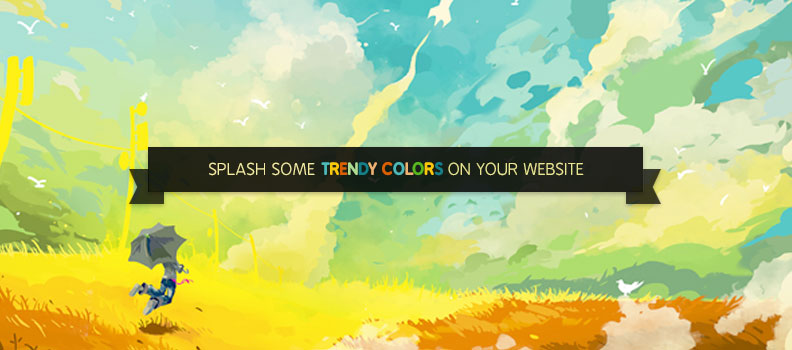
Design style in the web world is constantly on a transformation mode but colors still continue to be the epitome of designs and attract more eyeballs. According to a study about 60% of acceptance or rejection of website depends on colors. So, if you want your website to get easily noticed, play with colors. Now playing with colors, doesn’t mean to empty the crayon box. Even an artist uses only those colors that make his painting alluring, so imagine as if you are an artist, the website is your canvas and utilize colors that will make your website stand apart from others. This element has a natural essence to catch attention of human eyes which is very essential for a striking website.
You paint your home at regular intervals to make it look fresh, welcoming as well as trendy similarly even your website needs color-change. If you are stuck with the same old colors, it will disinterest the visitors. Are you puzzled about the latest color trend in the digital world? Don’t worry we will help you out. Alter your website with the latest color trend and give it a new life.
Have fun with neon and bright colors:
After being the hottest color trend in fashion and home interiors, neon and bright color shades is now ruling the digital world. The fresh and vibrant colors instantly add verve to your website. You can use the eye-popping fluorescent color as the main design component or as a complementary color. Though these colors are experimental, designers are being bold and coloring their websites with neon and bright shades. Blend neon with bright colors and add fun quotient to your website. Black text placed on neon background creates a great impact. These retro style websites are instant attention-grabbers.
Grayscale or black with bright accent:
When in doubt go for black, this statement is not just apt for apparel fashion but even for your websites. Black was, is and always be a trending color. Black or grayscale background with bright accents looks bold and beautiful. It even highlights the features more subtly and stylishly. The clear and distinctive grayscale background with striking bright accents like red or electric pink is really accentuating. These website color combinations are suitable for photography, media, fashion and lifestyle portals. The website looks livelier when integrated with aesthetically clicked images. Well, even the owls will find website with this color combination, attractive.
Shades of nature:
Give an eco-friendly feel to your website by incorporating the shades of nature. Hues of verdant greenery, sky-blue, sea-blue, sun yellow are not the hottest but the coolest color trends on the web world. This color scheme is light on eyes and also user-friendly. The bright greens make the white and black space to pop out. Emerald green was chosen to be the color of 2013 and even this year the color will be spotted in numerous websites. If you are choosing a green background, keep your text white to make more eye-pleasing.
The soft muted pastels:
The muted colors usually used for elegant home décor even make the website look rich and classy. The combination of soft and neutral colors brings sophistication to your web design. This color scheme is extremely flexible. It makes the flat design websites look more polished. A large scale photography tinted with warm pastel hue creates a feeling of nostalgia and soothes the viewers due to which they feel connected with your website. The pastel color palette consists of subtle colors like blue, brown, yellow and green. It has a certain vintage sense which is warm and engaging.
Colorless world is an impossible conception and so is your website. Color is one of the fundamental elements of web-design and a best source for communicating your business idea.

