To understand the importance of web design, imagine you’re about to set out on an epic adventure. Your bag’s packed, the water bottle’s full, and your hiking boots are tightly laced. Then, you realize you’ve forgotten the most important thing: The map.
With its absence, you will likely get lost, frustrated, and eventually give up on the journey. The same thing happens with a website. Proper website navigation through the digital wilderness is like a journey without a map.
What is Website Navigation in Web Design?
Website navigation is how all pages of the site or parts are traveled. It’s much like the digital equivalent of an adventure map. If clear navigation is lacking, the user may end up endlessly treading in circles or missing key information, possibly making them abandon the journey.
What makes a website easy to navigate?
An easily navigated website is like a dense forest where everything is well-marked. Clean paths, signs at each intersection, and a map at the entrance—these are what make for good navigation. But what exactly are the elements that make it up?
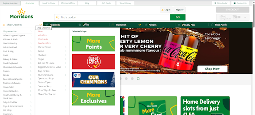
Confusing menus like those on this website make for Bad Website Navigation.
- Intuitive Layout: A user must get what they want without using a compass. This means that menus, categories, and links need to be rationalized.
- Consistent Design: Like trail markers, ounce the user IDs with consistency along the path. Use a consistent design throughout the site.
- Mobile or Responsive Design: The trail should be easy to follow, no matter whether using a desktop, tablet, or smartphone.
The Dangers of Bad Website Navigation: A Hike Led Astray
Have you ever looked blankly at a website, just wondering where in the world the shopping cart is hiding? Yeah, we did too. That’s why navigation is more important than that third slice of pizza. Probably.
Why is Navigation Important in Web Design? Because without a clear roadmap, visitors are lost much quicker than a tourist with a faulty map. The result is frustration, confusion, and a one-way ticket to your competitor’s website.
1. User Frustration
Imagine you’re climbing a mountain, and all of the trail markers are either very vague or missing. Pretty frustrating, correct? Well, poor navigation does the same thing: users get lost and frustrated. They can’t find anything that they need, and may very well just go elsewhere—to a more clearly marked trail, if you will (your competitor’s site).
2. Higher Bounce Rates
In the online world, a high bounce rate is like turning back home before you reach the first scenic viewpoint. Users land on your page and just leave because they can’t seem to find their way. Search engines notice this, and your site’s ranking can plummet faster than a hiker tumbling downhill.
Are you struggling with higher bounce rates? We can help.
3. Lost Conversions
A well-designed path leads adventurers to their goal, which is the stunning summit. In the same way, effective navigation will guide users through their actions, which could be purchasing or subscribing to a newsletter. Poor navigation will lead them to a dead end, which means losing traffic upon conversion.
4. Poor Impact on SEO
Search engines are a bit like your adventure guides. They need knowledge of your site structure to lead others to it. If the navigation is bad, search engines find it pretty hard to perform a crawl and indexing of the site. It’s like storing your trail deep in the undergrowth where adventurers can’t find it.
Not seeing your website on googles first page for commercial search terms? Lets investigate.
The Best Buy Website Case Study
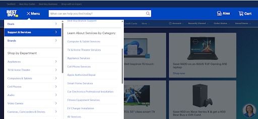
The Best Buy website is an example of Poor web navigation
Even tech giants fall prey to navigation nightmares. Alex Orlov performed a UX case study on Best Buy’s Mobile Site and discovered major mishaps that become the roadblock for a user eyeing their service offering. Customer interviews and usability tests revealed that the “Geek Squad Plans and Services” and its subcategories were areas with maximum misunderstandings.
Misleading titles like “TV Mounting Tool” and an overcrowded interface made it very hard for people to make an appointment. This case study illustrates that navigation may seem like a very small frustration to users but can still be a real drain on your bottom line. If even a brand as trusted as Best Buy can misstep, as Orlov’s research revealed, it illustrates the importance of having very clear and user-friendly navigation for any website.
The Website Design Process: How to Create a Perfect Map.
Setting up a website is much like planning an expedition. Here’s how to make sure your navigation is top-notch:
- Planning and Research: Know who your audience is, what trails they’re looking for, and the destinations (pages) they want to get to.
- Wireframing and Prototyping: Sketch the draft of your map. Bare-bones wireframes show the key paths users will take.
- Testing: Before you begin your journey, test the trails. Usability tests ensure that users find navigation easy and intuitive.
- Iterations: Just as trials have their cycles of maintenance, so does your site. Feedback should be used continually to enhance and refine navigation.
The ASOS Case Study: Epitome of fine web design and navigation
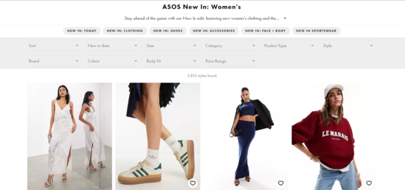
Forget treasure hunts—ASOS’s website navigation is like a personal stylist who whispers outfit ideas in your ear.
Clear, categorized filters make it possible to find a top in less time than it takes to say, “retail therapy.” Not like those e-commerce sites where you drill down page after page of randomness; the chances of landing on a irrelevant product here are less than the chances of seeing a unicorn at a disco.
ASOS proves that the idea of flawless navigation does not have to be a myth; rather, it can turn into a sweet reality.
Need a quick audit of your ecommerce site navigation? Lets start.
Why Native Drop-downs are a Poor Choice for Navigation?
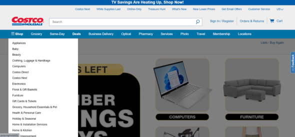
Example of Native Drop-down menu on Costco’s Web Design
Imagine a restaurant menu in which you can only see a few dishes at any time, and scrolling through the choices feels more like a guessing game.
That’s the frustration users have with such websites because many hinge on native drop-down menus for navigation, even more on mobile devices. Reporting for this study, Baymard Institute—a research powerhouse on UX—uncovered that such kinds of menus expose very narrow views of options, which are also pretty inaccurate to scroll through.
What’s wrong is that native drop-downs only occupy an extremely small part of the screen real estate, forcing users to incessantly scroll up and down to see all options.
That doesn’t only get frustrating but also leads to lost opportunities for users, who may give up before finding what they need. The Baymard Institute says use needs to stop with such limitations and go for custom mobile navigation UIs.
These can show up with all of the options on view at once and often take up the whole real estate of the screen. Built to scan and compare choices at will, this makes a user feel in control of their browsing experience. So as you design website navigation the next time, remember: a clear view is just as important as a delicious menu!
The Adidas website below shows us how to combat this issue and design better navigation.
Looking to design a similar menu for your website? We can help.
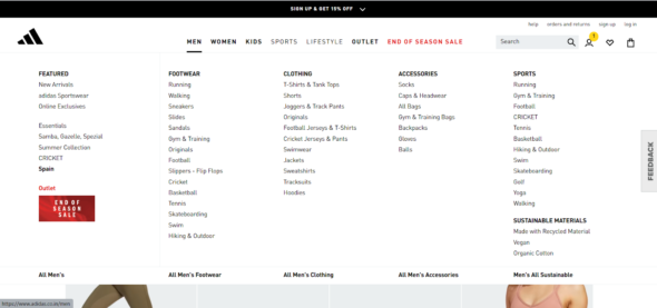
Adidas solving the issue of the Native Drop-down menu
Conclusion: Paving the Way with Web Design
For a website, navigation serves as your best map to help usersโรง go through pages to their desired destination without frustration. Navigation, when poor, can result in user frustration at best. High bounce rates, lost conversions, and negative SEO impact at worst.
You need to avoid this pitfall in your web design by writing a clear, intuitive, and responsive navigation plan.
Just before one saddles up and rides out into the setting sun on one’s next web design project, it’s important to bear in mind that a good map not only guarantees a successful journey but also ensures your adventurers return, craving more.
Happy trails and happy designing!
Your Search for a Web Design company in Pune ends here
Are you looking for a Web design company in Pune to help you with your website navigation? Contact us
Now that you know why navigation is important in websites and custom applications, we can audit your existing website or application to understand real user challenges and help you re-organize and re-design the navigation to be more effective.
Are you concerned about your website navigation? Or could it be better? Let’s chat.

